ProductsAll Products
.NET Components
 Open Vision for .NET
 NOV Chart for .NET
 NOV Diagram for .NET
 NOV Rich Text Editor for .NET
 NOV Grid for .NET
 NOV Schedule for .NET
 NOV Gauge for .NET
 NOV Barcode for .NET
 NOV User Interface for .NET
 Vision for .NET
 Chart for .NET
 Diagram for .NET
 User Interface for .NET
 Vision for SSRS
 Chart for SSRS
 Gauge for SSRS
 Map for SSRS
 Barcode for SSRS
 Vision for SharePoint
 Chart for SharePoint
 Gauge for SharePoint
 Map for SharePoint
 Barcode for SharePoint
DownloadsAll Downloads
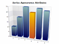
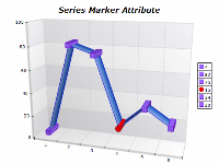
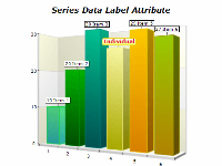
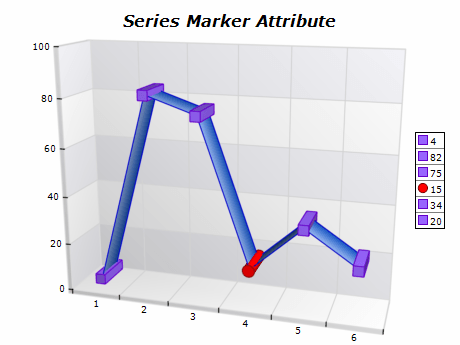
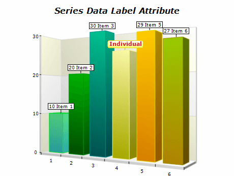
Series provide attributes that allow the user to customize the appearance of individual data points. These attributes include settings for custom filling, stroke, image filter, material, and data point marker. This allows highlighting data points of interest as well as adding an additional dimension to data - for example, applying colors that correlate to a value that is not plotted on the chart.
The following images show charts with data points that have individual series attributes.
| ||||||||||||
|
Distinctive Colors
Use distinctive colors to highlight individual data points in the chart.
Consistent Formatting
Maintain consistent formatting across the other elements in the series and the data points you want to highlight. This includes consistent use of fill styles (solid, gradient, image), line styles (solid, dashed, dotted), and marker styles (circles, squares, etc.).
Labeling
Clearly label each series in the chart. Labels should be concise yet descriptive enough to understand each series's representation without confusion. Avoid cluttering the chart with too many labels.