Keep It Simple
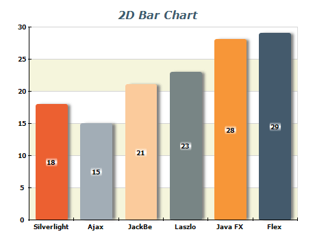
Use a simple and clean design for your bar chart. Avoid adding too many colors or other design elements that can distract from the data.
Choose the Correct Type of Bar Chart
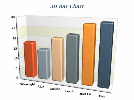
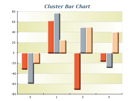
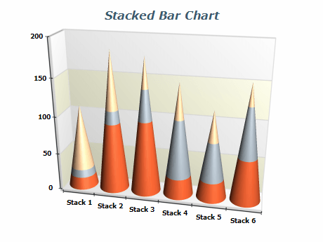
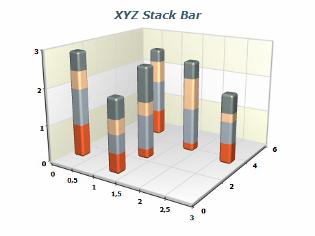
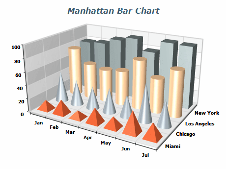
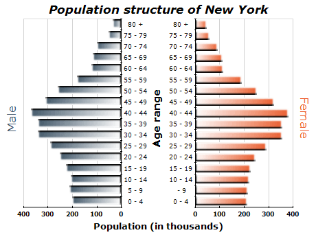
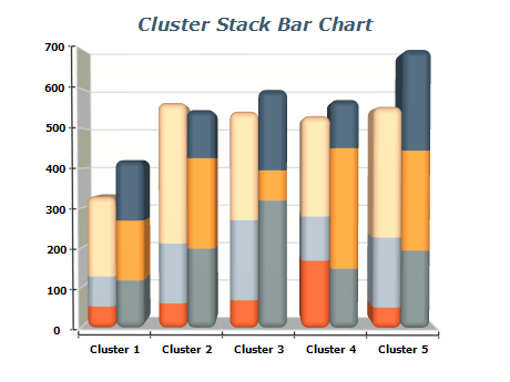
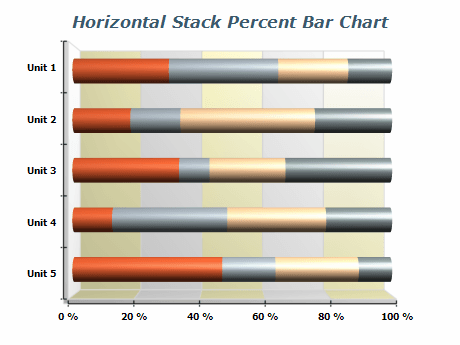
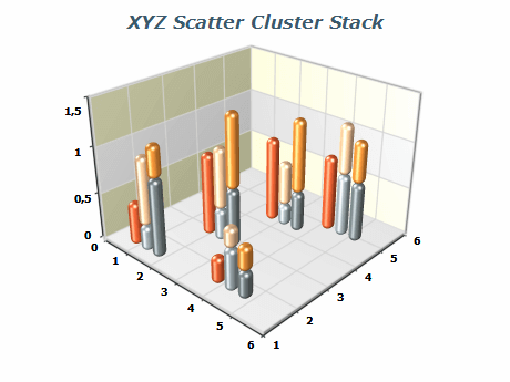
There are many different bar charts, such as stacked, grouped, horizontal, etc. Choose the type that best suits the data you are trying to visualize.
Label Your Axes
Always label the x and y axes to clarify what the data represents. Include units of measurement, if applicable.
Context
Provide context to the data by including a title or subtitle explaining what the chart represents and any meaningful information relevant to interpreting the data.
Order Your Bars
Order your bars logically, making it easy to compare data. For example, you may want to order bars alphabetically, chronologically, or by size.
Use Appropriate Scales
Choose an appropriate scale for your y-axis. This will depend on the range of values you are visualizing.
Highlight Important Data
Use color or other visual elements to highlight important data or trends. For example, you may want to use a different color for the highest bar in a group.
Avoid Clutter
Avoid cluttering your bar chart with too much data. Suppose you have a large amount of data to present. In that case, it may be beneficial to consider using a combination of multiple charts or alternative visualization types to display the information more effectively.

 Open Vision for .NET
 NOV Chart for .NET
 NOV Diagram for .NET
 NOV Rich Text Editor for .NET
 NOV Grid for .NET
 NOV Schedule for .NET
 NOV Gauge for .NET
 NOV Barcode for .NET
 NOV User Interface for .NET
 Vision for .NET
 Chart for .NET
 Diagram for .NET
 User Interface for .NET
 Vision for SSRS
 Chart for SSRS
 Gauge for SSRS
 Map for SSRS
 Barcode for SSRS
 Vision for SharePoint
 Chart for SharePoint
 Gauge for SharePoint
 Map for SharePoint
 Barcode for SharePoint