Choose an Appropriate Data Set
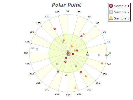
Polar charts are most effective for data sets that depend on angle and magnitude. Consider whether this chart type is the best choice for your data.
Label Your Axes
Label your angle and value axes to ensure users can easily interpret the data. Use clear and concise labeling that is easy to understand.
Use Appropriate Scaling
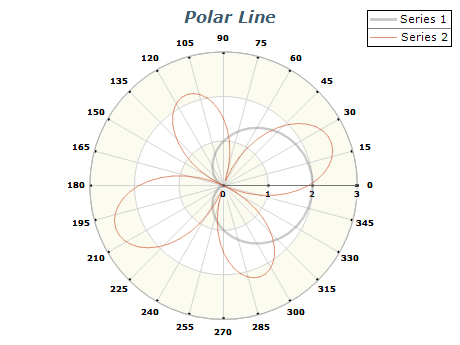
Choose a proper scaling for your chart to ensure all data points are visible and easily interpreted. Consider using logarithmic scaling for the polar value axis for data sets that contain data that differ in magnitude.
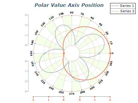
Optimize Axis Positioning
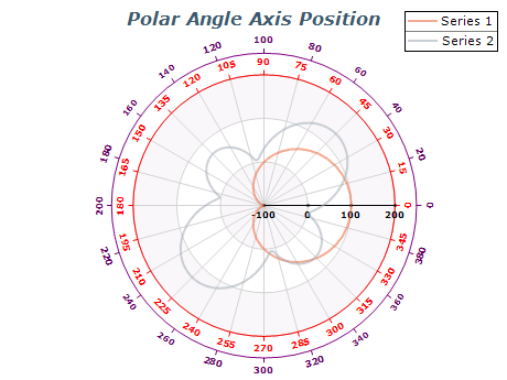
Ensure that your angle and value axes are positioned to maximize clarity and readability. Use evenly spaced intervals and appropriate ranges to optimize axis positioning by using the axis docking and reflection paint features.
Use Color Coding
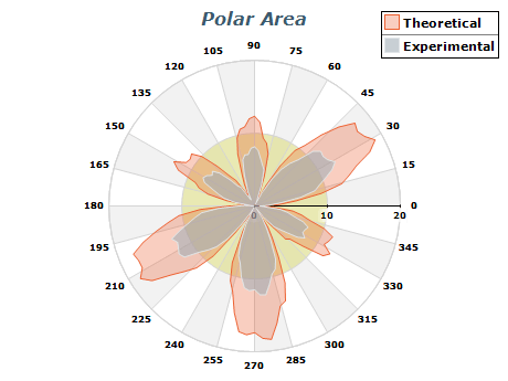
To enhance readability or to add another dimension in data, consider using color coding or palette filling of the data.

 Open Vision for .NET
 NOV Chart for .NET
 NOV Diagram for .NET
 NOV Rich Text Editor for .NET
 NOV Grid for .NET
 NOV Schedule for .NET
 NOV Gauge for .NET
 NOV Barcode for .NET
 NOV User Interface for .NET
 Vision for .NET
 Chart for .NET
 Diagram for .NET
 User Interface for .NET
 Vision for SSRS
 Chart for SSRS
 Gauge for SSRS
 Map for SSRS
 Barcode for SSRS
 Vision for SharePoint
 Chart for SharePoint
 Gauge for SharePoint
 Map for SharePoint
 Barcode for SharePoint