ProductsAll Products
.NET Components
 Open Vision for .NET
 NOV Chart for .NET
 NOV Diagram for .NET
 NOV Rich Text Editor for .NET
 NOV Grid for .NET
 NOV Schedule for .NET
 NOV Gauge for .NET
 NOV Barcode for .NET
 NOV User Interface for .NET
 Vision for .NET
 Chart for .NET
 Diagram for .NET
 User Interface for .NET
 Vision for SSRS
 Chart for SSRS
 Gauge for SSRS
 Map for SSRS
 Barcode for SSRS
 Vision for SharePoint
 Chart for SharePoint
 Gauge for SharePoint
 Map for SharePoint
 Barcode for SharePoint
DownloadsAll Downloads
| ||||||||||||
|
| Month | New York | Los Angeles | Miami | Chicago |
|---|---|---|---|---|
| January | 32F | 65F | 70F | 20F |
| February | 30F | 68F | 72F | 23F |
| March | 40F | 70F | 75F | 32F |
| ... | ... | ... | ... | ... |
Choose the Right Data
Heat map charts work best with large datasets with a clear structure. Be sure to choose data that can be quickly sorted and displayed in a grid-like format.
Use a Palette Scheme That Makes Sense
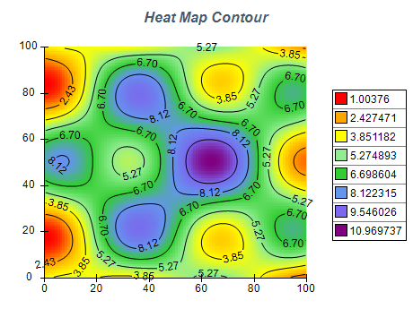
Color is a critical element of heat map charts so using the appropriate palette is critical. For example, if displaying a temperature you should use warmer colors for higher values and colder colors for lower values. This will make the chart more intuitive to the user.
Label Your Axes and Legend
Clearly label your heat map chart's x and y axes so that viewers can easily understand the data. Also, provide a legend that explains the color scale.
Use Heat Maps to Identify Patterns
Heat map charts are especially useful for identifying patterns in data, such as hotspots or clusters.