ProductsAll Products
.NET Components
 Open Vision for .NET
 NOV Chart for .NET
 NOV Diagram for .NET
 NOV Rich Text Editor for .NET
 NOV Grid for .NET
 NOV Schedule for .NET
 NOV Gauge for .NET
 NOV Barcode for .NET
 NOV User Interface for .NET
 Vision for .NET
 Chart for .NET
 Diagram for .NET
 User Interface for .NET
 Vision for SSRS
 Chart for SSRS
 Gauge for SSRS
 Map for SSRS
 Barcode for SSRS
 Vision for SharePoint
 Chart for SharePoint
 Gauge for SharePoint
 Map for SharePoint
 Barcode for SharePoint
DownloadsAll Downloads
Table Scale | ||
|
Appropriate Value Formatting
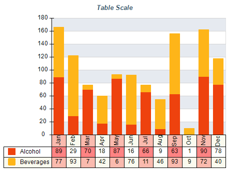
The table displays the series values that scale on the axis. Those values are generated by the same rules as regular series data labels, so make sure you have proper value formatting applied for each series.
Short Labels and Clear Spacing
Avoid using long category and series names. Long category names may become unreadable in case you have many categories in the chart. The same applies to series names, that appear as table row headers and can push the left margins of the chart, which will leave less room for the chart plot thus making it unreadable.